Apparently, the update stands for a new direction.
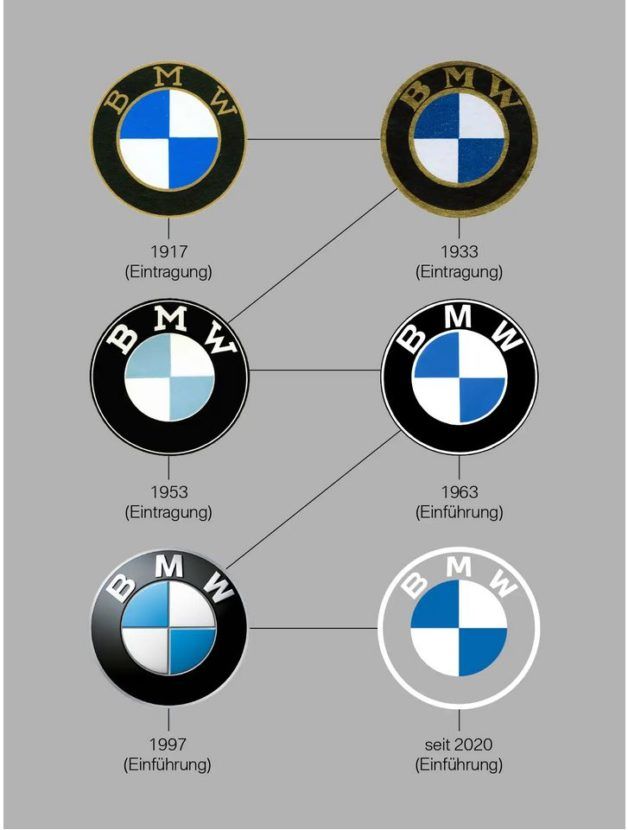
There’s no denying BMW has changed course in many ways in the past decade, and even more in the past two decades. To help signal the direction the storied Bavarian automaker is taking, BMW has updated its logos for the first time since 1997. You’ll notice the biggest change is the black ring around the shield is gone, with everything else virtually the same, and it’s a significant difference.

According to Jens Thiemer, BMW Senior Vice President Customer & Brand, this shift signals that the automaker is transitioning into a “relationship brand.” Getting rid of the black ring is supposed to make BMW feel more open and transparent to younger car shoppers. It’s also supposed to work better for digitization, although exactly how isn’t entirely clear. The new logos aren’t three-dimensional in appearance, so that might have something to do with it.

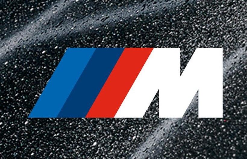
Changes are also here for the BMW M and BMW i sub-brand logos. Both have a two-dimensional appearance, but the M logo still retains its characteristic tri-color bars, meaning tradition hasn’t been erased.

Speaking of tradition, many mistakenly still believe the BMW badge is a depiction of airplane propellers against a blue sky. It’s actually representative of the Bavarian coat of arms, with the colors inverted. The black band around this shield has been present since 1917, so removing that element from the design is a huge departure from a storied past.

The one thing you can count on in life is change, so it was only a matter of time before BMW switched up its logos. This could signal a shift in the approach the brand is taking, it could reflect shifts which already have been set in motion, or it could just be an aesthetic change. Time certainly will tell what holds true, but one thing’s for certain: some will love the new logo and others will hate it.
Images credit: BMW
More BMW News


